.png)
Improving Conversions Through Simplified Interactions
NGAP is a Philadelphia-based organization that helps rescued greyhounds find their forever homes. I l led a UX team to revamp their website and helped turn visitors into donors and adopters.
.png)

Discovery and requirements gathering
Rebuilding brand identity
Prototyping
My Role
UX Designer
Facilitated stakeholder interviews
Visual direction and UI design
Design QA
Duration: 5 Months
NGAP website had an outdated website with little to no leads on adoptions of current dogs onboard
Business Challenge
How might we provide up-to-date information on adoption and reduce the drop-off rate?
70%
visitors leave the website on the landing page
90%
of donation outreach is done via Facebook and Instagram
of interested donors leave the page on payment form gateway
60%
Usability Testing
I led a quick expert usability test to discover some of the website's major issues. We started with NPCI heuristics to find the severity score to help identify high-impact and low-impact issues in the current design.
We got an average severity score of 4/5 which meant we had some major usability issues to solve.
Visual presentation, information architecture, and navigation needed the most focus.
Uncovering issues using the CUBI & NPCI model and Tree Testing


Understanding new and updated goals
Stakeholder Interview Insights
After the expert review, I conducted virtual interviews with the co-founders and the tech team for an all-round perspective
As the website was built more than a decade ago, brand goals did not resonate anymore. The team was having difficulty communicating that on the website.
Find homes for former racing greyhounds
Website Goals
Newly added
Spread awareness about the plight of greyhounds
Provide specialized medical care to greyhounds
Re-donating supplies to other animal shelters
Providing medical care for all dogs and cats
Collecting user's highs and lows from adopters, donors and volunteers
Customer Journey Mapping
We spoke to 23 people who were a group of Adopters, Donors, and Volunteers at NGAP. We built three carefully cureated customer journey maps for each persona to determine the major lows in their journey vs the major highs. These insights combined with the stakeholder interview themes helped me define focus areas for the new design.
Content Strategy and Information Achitecture
Collectively simplifying tagline and content structure
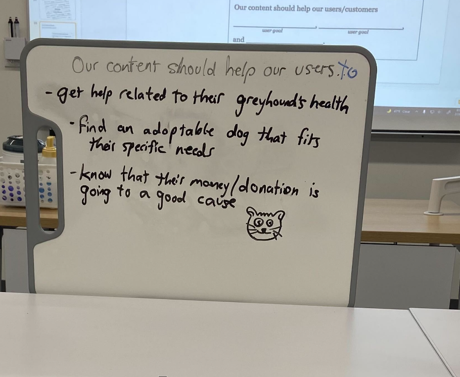
NGAP had its goals updated with time which needed to be on the website. I led the workshop that came out with one main tagline that was going to be on the landing page.

We help provide loving forever homes to our previously rescued dogs
+
We seek to share our knowledge, support, and awareness of sighthounds with the surrounding community
We seek to provide loving forever homes to the rescued dogs in our care and share our knowledge, support, and awareness of sighthounds with the surrounding community
Content Audit: what we observed
Overlapping Information


No controlled vocabulary: multiple names for the same page through different navigations
Links take to pages that are not secure, which reduces trust
Lack of call to action buttons which is confusing
Our next steps were to address the issues we came across, so we started with card sorting: open and close. We opted for both ways of card sorting to understand if menu items make sense with the labels under them and vice versa.
We had 5 users for each open and closed card sort, which gave us a lot of insights into our main navigation.
After finalizing the structure of our finalized main nav, we started with wireframing the rest of the website.


Main Nav Design
Approach
Consistently validating iterations with our personas

I wanted to bring the user's focus immediately to the primary needs of NGAP: Donations and Adoptions.
has been in business for over a decade and hence had its personas well-defined and backed by numbers already
Before we jumped into designing, I ensured our new approaches, changes, and design concepts were in line with our 3 target personas.
Final Design
The all-new impactful experience

Design QA and Handoff
Bringing quality in handoff and implementation
The desktop versions of each screen were handed off with all components linked to the style guide.
3 rounds of design QA testing were conducted to ensure the design was replicated in the production.

Impact


.png)
.png)